

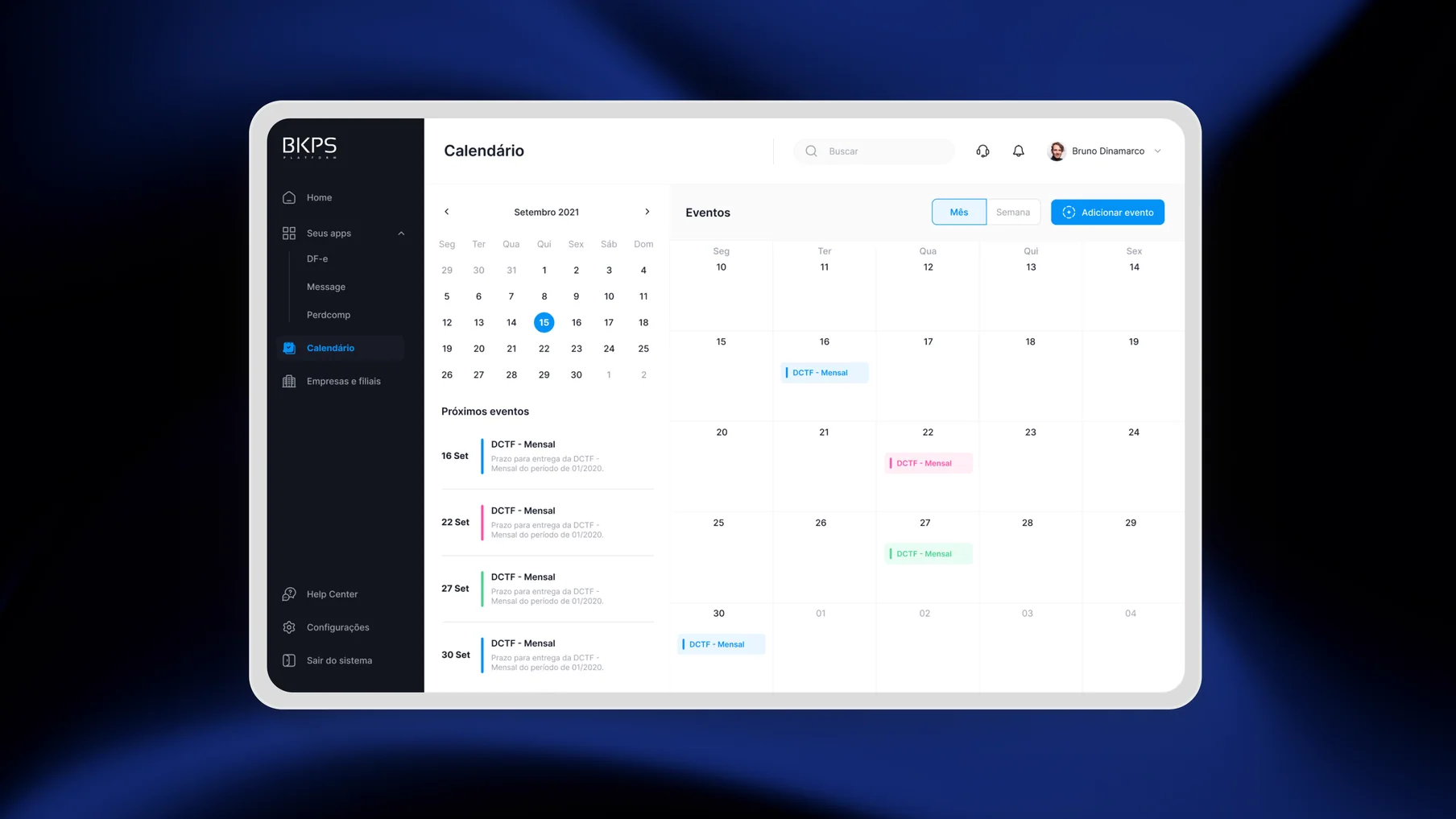
The BKPS Platform, a complete suite of tax solutions offered by Bookeepers, used to look archaic and awkward, causing a substantial number of support requests and a loss of customers over time. My task was to completely revamp the platform, providing a rejuvenated interface and new features for existing and new users alike.
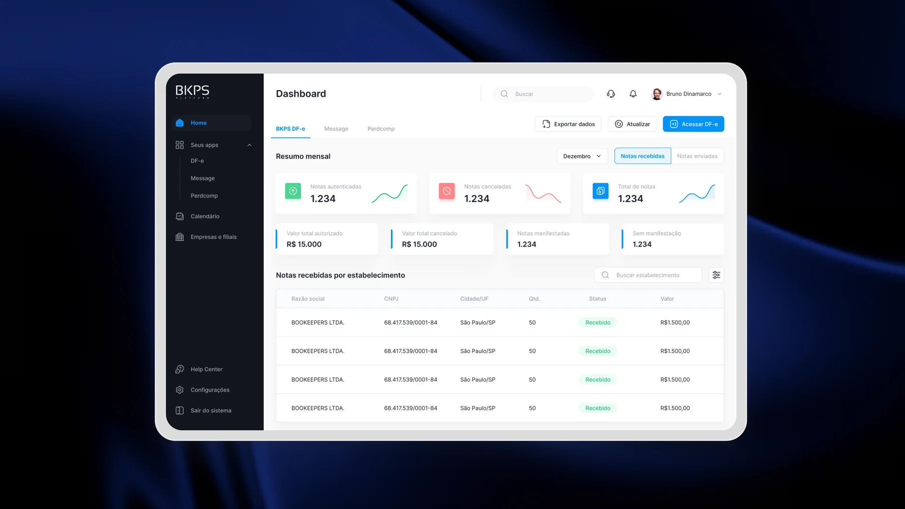
BKPS brought three distinct tax workflows into one product. The redesign needed to make each module easier to understand while preserving a coherent experience across the suite.
DFe (Tax-document operations)
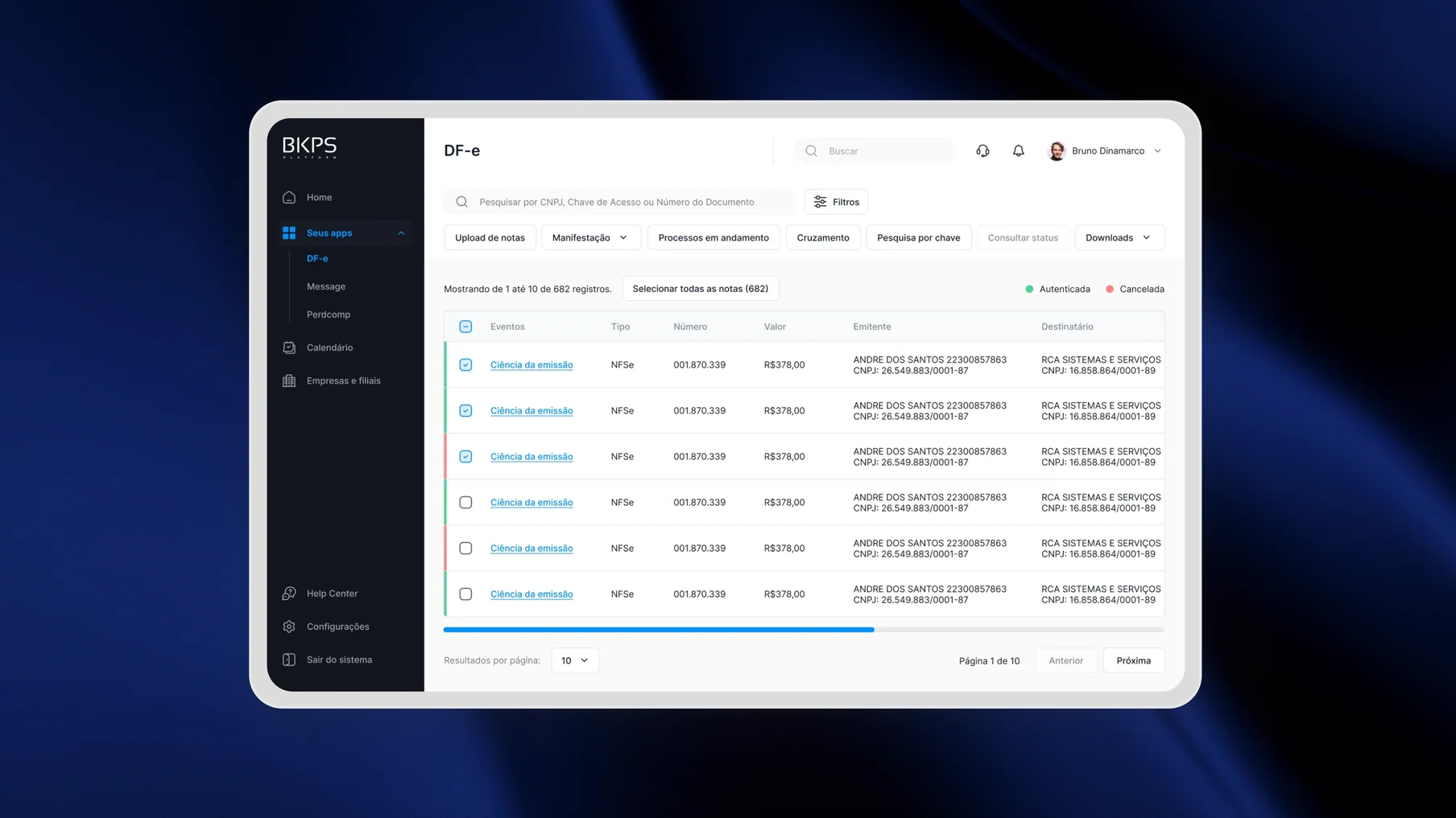
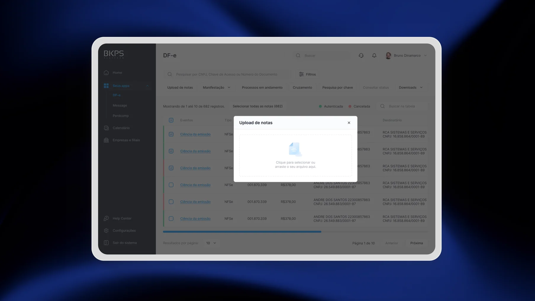
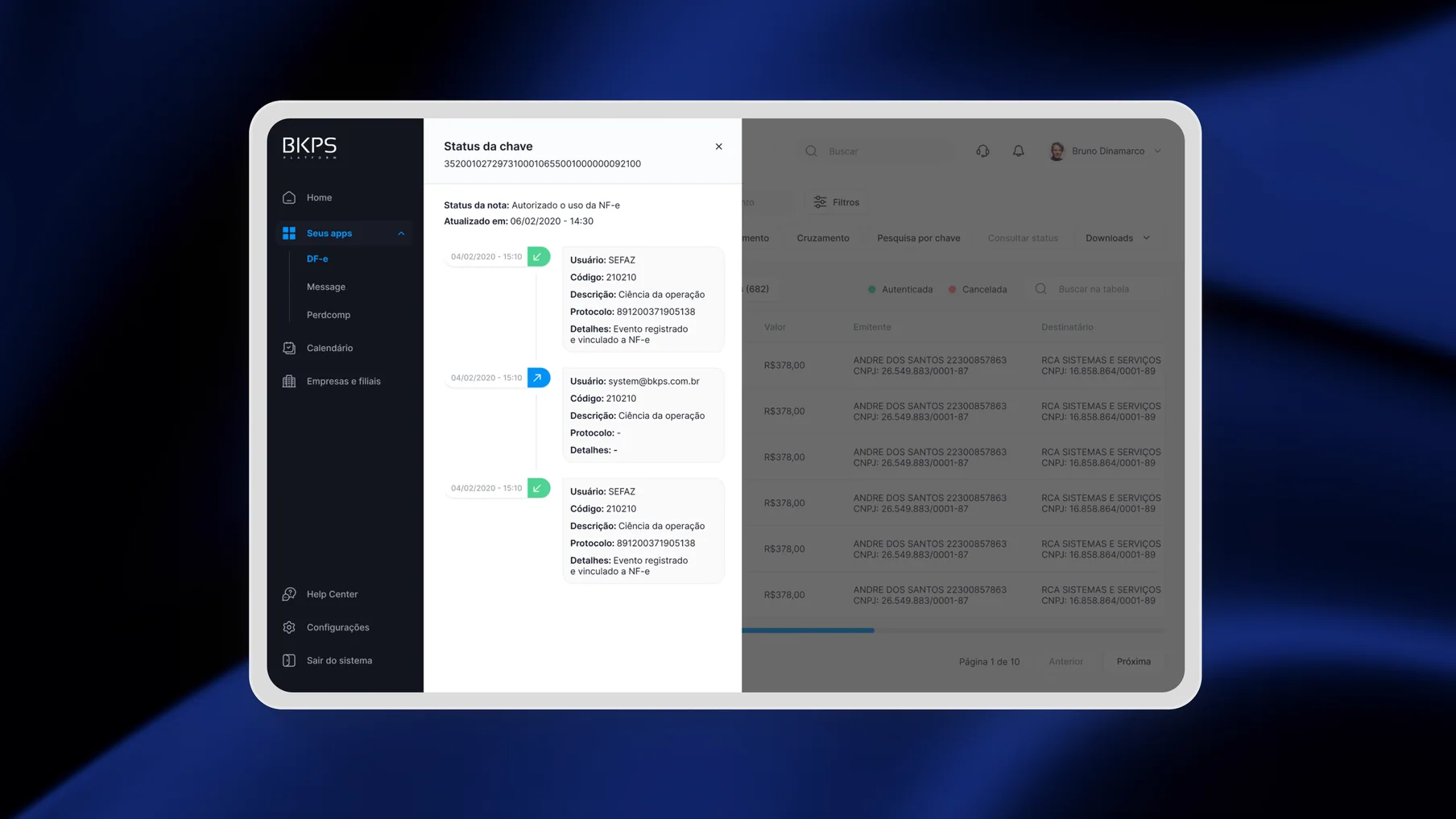
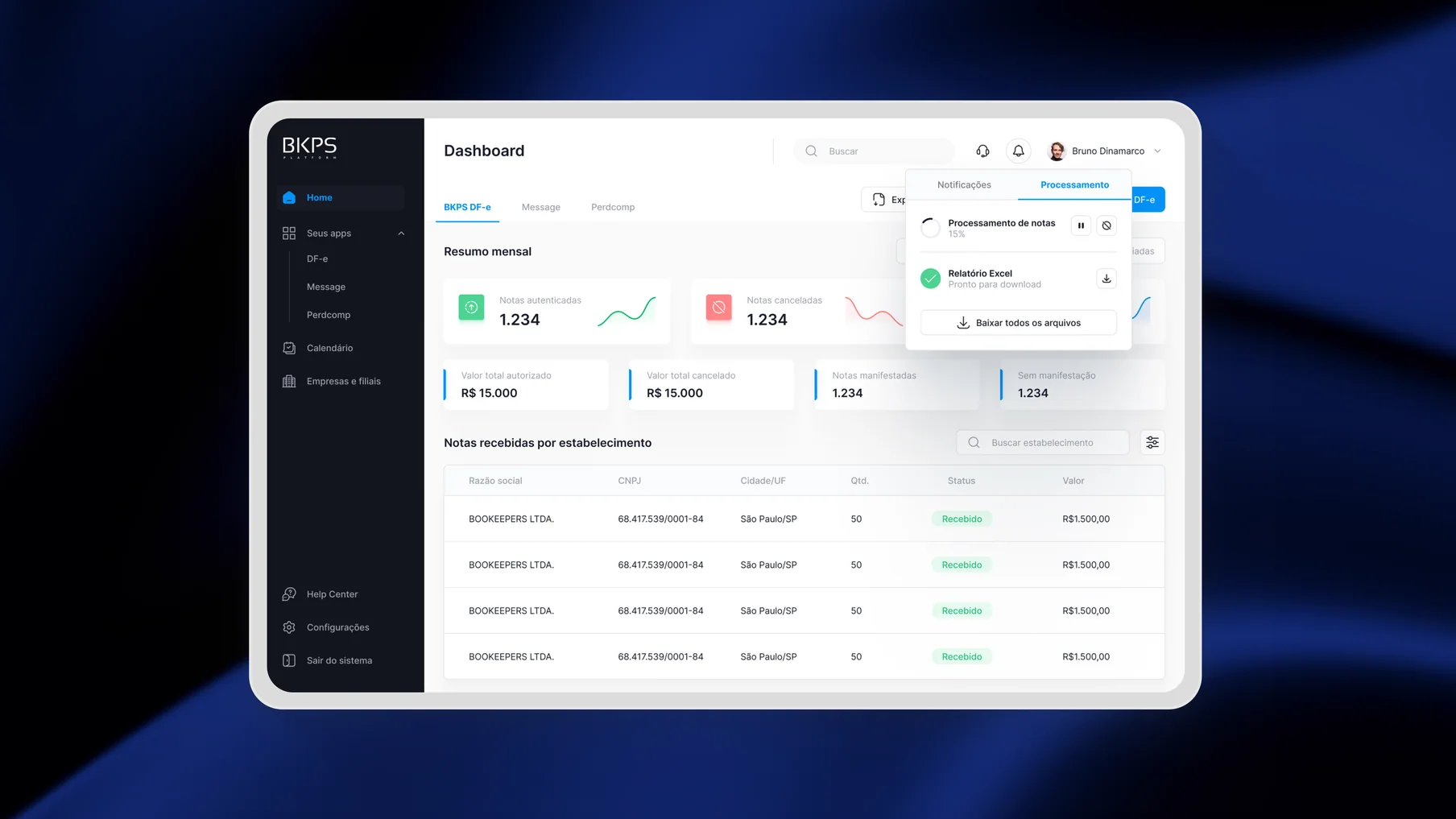
A central place to inspect invoices, generate reports, perform tax manifestations, and download documents individually or in bulk.
Message (Government communications)
A service that collects messages from multiple tax-authority inboxes and brings them into a single queue.
PerdComp (Compensation claims)
A module for downloading and monitoring compensation requests without checking each claim separately.
PROBLEM
The system fell short on multiple usability principles, leading to numerous tech support inquiries and causing an immense backlog. Several business regulations got overlooked due to the product's inadequate usability. Consequently, we needed to overhaul the platform, update its interface, the overall user experience, and consider introducing features that could enhance the user workflow. However, we faced a tight timeline for the project, which necessitated a lot of improvisation throughout the journey to utilize available time efficiently.
BEFORE SCREENS
With a short timeline, the research focused on the people closest to recurring friction and combined qualitative evidence with a structured product review.
2 support specialists
Interviews exposed the recurring issues behind incoming tickets: certificates, deleted data, company setup, slowness, and timeouts.
5 customers across different companies
Conversations revealed excessive steps, confusing registration, difficult listings, hidden functionality, and missing information.
Heuristic and competitive reviews
I evaluated the product against Nielsen's usability heuristics and compared it with competitors Arquivei, Oobj, and NFe.io.
ARCHITECTURE
Research showed that the problem was structural, not only visual. I ran a card-sorting workshop with stakeholders and translated the result into a new sitemap. The goal was to reduce steps across high-frequency journeys without flattening a platform that genuinely needed deep navigation.
Design principle: group the product around the work users were trying to complete, then reveal specialist depth progressively.
SOLUTION
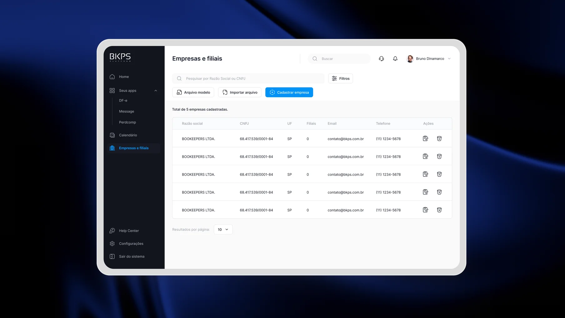
The updated iteration of the BKPS Platform introduces numerous enhancements aiding users to boost efficiency in their daily tax routine, alongside a fresh, contemporary appearance and numerous personalisation options.
Moreover, the entire registration flow has been restructured, guaranteeing users can commence utilisation of the platform swiftly, requiring minimal support.
From product thinking to pixel perfect delivery
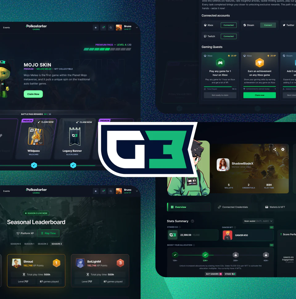
I design and ship high-quality interfaces across complex products, bringing visual craft and product thinking together from first frame to final delivery.

Got a project
in mind?
I'm always open to new projects, collaborations and opportunities. If you have something in mind, let's talk about it.